DEFTeam’s Dashboard Component (DDC) - Why Do You Need It?
If you are tired of paying hefty fees to vendors for just doing reporting and visualization on a core/user basis, you need to look at DDC (DEFTeam’s Dashboard Component) - a support only reporting (pixel perfect) and dashboarding solution that does not charge on a user/core basis. So, you get to use DDC on an unlimited basis under the support agreement without any pressure of paying more for increased users as you grow.

We understand that more than 90% of the Business Intelligence is based upon production ready reports and dashboards that could be drilled down on multiple levels to slice and dice the data on a user access basis. DDC provides connectivity to a large set of databases and can scale up to terabytes of data marts. DDC support also covers all the solutions that are developed by us. DEFTeam Dashboard Component solution provides an answer to your data analytics, reports and dashboard requirements.
Understanding DEFTeam’s Dashboard Component
DDC is a custom dashboard plug-in, which is a data visualization component that combines reports, graphical indicators, charts, and KPIs on a single screen and displays a consolidated view of summaries of information to the end-users at-a-glance allowing them to export the whole dashboard or its individual dashlets to distinct file formats, viz., PDF, Excel, CSV, DOCX, etc.

DDC is compatible with Windows, Linux and MAC OS X and has the key features like:
- Custom & Dynamic Dashboard
- Dashboard Management
- Available in multiple languages (Hindi, Arabic etc.)
- Interactive Data Exploration
- Data Visualization
- NRT data with auto-refresh
Business Benefits of DDC
DDC component provides benefits to both business and IT users that enable self-service BI for organizations of all sizes. Key benefits of the DDC include:
- Full-featured dashboards.
- Flexible web-based architecture you can embed inside your application using secured Single Sign-On (SSO).
- Support only model that allows additional users, cores or instances at no extra cost.
- Full technical support from our experts to ensure a hassle free end-user experience.

The Features of DDC
At DEFTeam, we have designed visualizations with DDC components.
Visualization Mock-Ups of Charting Engines
We have created visualization mock-ups with DDC component using various types of charting engines.
-
Dynamic D3 Charts
D3 is an extremely fast, supporting large datasets and dynamic behavior for interaction and animation. We have embedded the most popular JavaScript charting engine “D3.js” and created a dashboard with the combination of multiple interactive and multi-level drill-down animated D3 charts.
-
High Charts/HTML 5 Charts
We have embedded different widgets available in HTML/High charts library. We have also developed a functionality of Zoom in and Zoom out.
-
Fusion Charts
Fusion Charts Suite XT is an interactive JavaScript charts for web, mobile and enterprise applications. Using the Javascript API of each chart, TIBCO JRS provides a lot more functionalities like client-side data updates, updating individual parameters, exporting charts as PDFs, and creating multi-level drill-down.
Visualization Mock-Ups of Mapping Engines
We have created visualization mock-ups with DDC component using various types of charting engines.
-
Google Maps
We have integrated the Google Map that can show the shipping status with different colored markers indicating the source and the destination and lines to represent the Airline routes. The Google Map also supports numerous levels of drill-down.

-
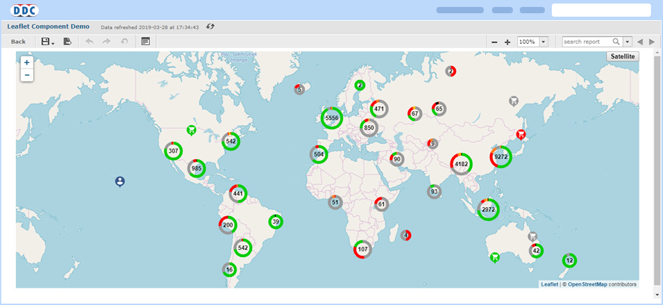
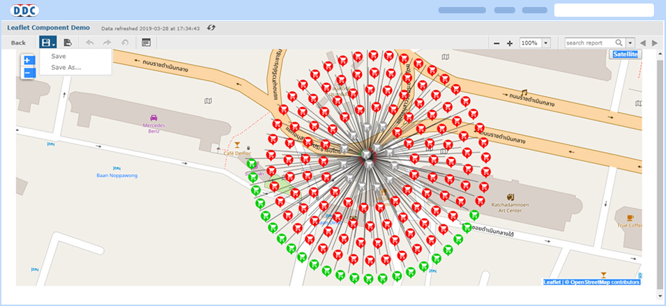
Leaflet Maps
We have integrated the Leaflet Map that forms a cluster of the markers and shows the number of items in each cluster, and as we zoom it adjusts the clusters based on the current view. This not only makes the map easier for the user to understand, it also efficiently displays the huge data points on a map.
Custom Visualizations Developed by DEFTeam
We have developed some customized visualizations which can be altered depending on the client’s requirement.
-
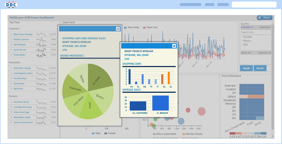
Multi-Layered Drill-Down
To provide flexibility to user to view all the drill-downs, detailed report information in one page rather than multiple browser pages/tabs, DEFTeam has created a component “Multi-Layered Dashboard”.
-
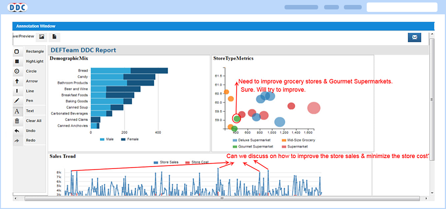
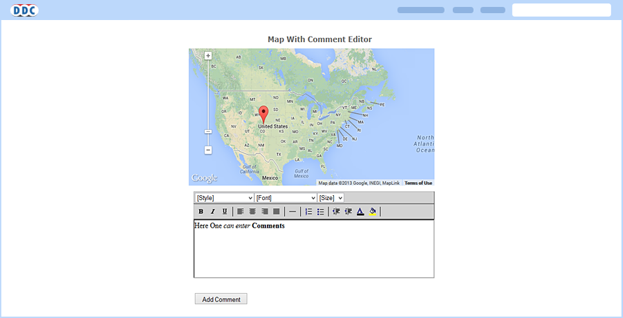
Interactivity in Reports – Comment and Chat
Interactivity in reports allows users to communicate through comments that can be inserted in the report. Inserted comments need to be saved for communication purposes. It displays the chronological order of the comments inserted, which are useful for analysis.
Visualization Mock-up’s of Standard Plug-ins
-
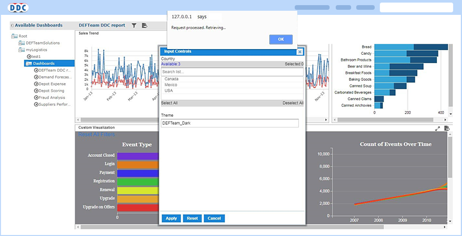
Save & Retrieve
The functionality of Save & Retrieve is implemented in the dashboard to allow users to save the selected Input control values with a unique name and then retrieve the past selections by selecting the previously saved selections name from Retrieve drop-down list. This enables user to retrieve the dashboard with saved input controls and dashboard will appear with the previously selected list of input options. This also helps to save time when a dashboard has numerous input controls.
-
Share Dashboard
DEFTeam also facilitates users sharing the dashboard with desired dashlets (reports), which helps the users to discuss with their peers when and where necessary. This can be achieved by annotating the captured dashboard and saving it as a PDF/JPEG and thus can be shared via email. Recipients can access this annotated dashboard for further communication.