Custom Visualizations Developed by DEFTeam
We have developed some customized visualizations that can be altered depending on the client’s requirements.
-
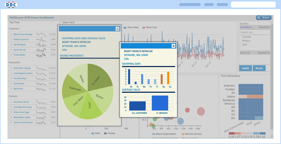
Multi-Layered Drill-Down
To provide flexibility to users to view all the drill-down detailed report information on one page rather than multiple browser pages/tabs, DEFTeam has created a component called “Multi-Layered Dashboard”.
-
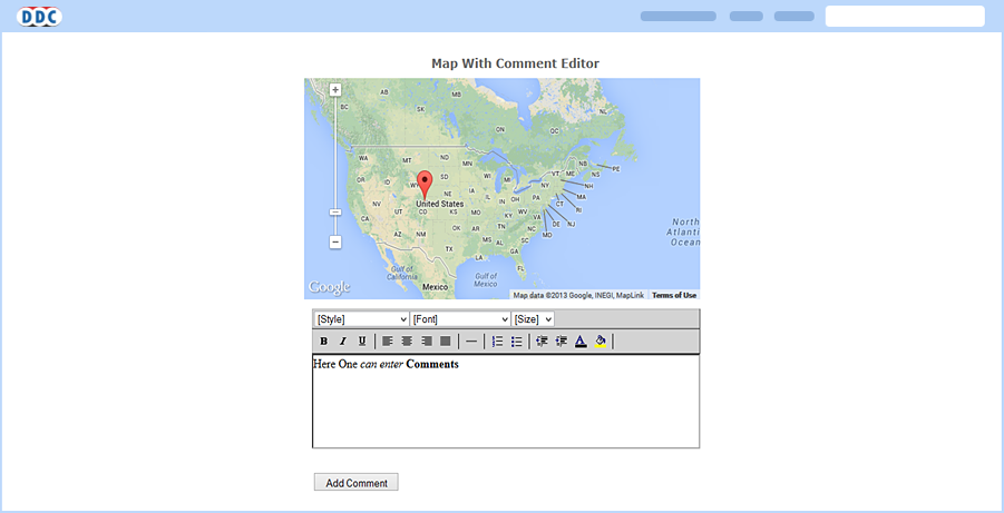
Interactivity in Reports - Comment and Chat
Interactivity in reports allows users to communicate through comments that can be inserted in the report. Inserted comments need to be saved for communication purposes. It displays the chronological order of the comments inserted, which are useful for analysis.
-
Drill-Through on Mouse Hover
This dashboard provides flexibility to the user to view the drill-down report on mouse hover on the main report. For example, on a dashboard, mouse hovering on a State may navigate to a drill-down report appearing as a pop-up to give the detailed report for that state.

-
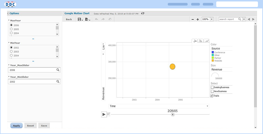
Google Motion Charts
We have integrated Google Motion Charts, which shows multi-variable changes over time. It is basically a motion chart that shows moving representation by time.
-
Tabs in Dashboard
Multiple tabs on the dashboard helps to have multiple views.
